Three core psychological factors in marketing (and how to integrate them)

Alix Carman, Content Writer, Adjust, Jan 31, 2024.
The intersection of psychology and marketing is fascinating. At the core of this crossroads are 'heuristics', those mental shortcuts we use to make decisions quickly and with minimal effort (often automatically, without conscious thought). These subconscious rules, deeply embedded in our cognitive processes, play a pivotal role in shaping user behavior and decision-making.
How users interact with an app and the decisions they make–whether to install, engage with, or purchase within an app–are all influenced by these mental shortcuts. While the overlap of psychology and marketing is vast, there are three core concepts that cover a lot of bases for marketers. The psychological principles of color theory, social proof, and scarcity can be leveraged to make mobile apps more appealing, engaging, and ultimately successful.
What is neuromarketing?
Neuromarketing, also known as psychological marketing, is the fusion of psychological principles and marketing strategies. Psychological concepts in marketing extend beyond mere behavioral analysis, incorporating a broader spectrum of cognitive insights to unravel why people think and act the way they do. In sum: Neuromarketing is all about understanding (and leveraging) what makes consumers tick.
Central to this practice is the exploration of the brain's decision-making processes. Despite the complexity of human behavior, marketing psychology principles only require a base understanding before they can be integrated into daily marketing activities. Of course, it’s important that these principles are applied ethically to protect the end user (more on that later).

Color theory: The psychology of colors in marketing
What is color psychology?
Color psychology, or color theory marketing is the strategic use of colors to influence consumer behavior and perceptions. This concept stems from the understanding that colors evoke emotional, psychological, and even behavioral responses, making them a potent tool in branding and advertising.
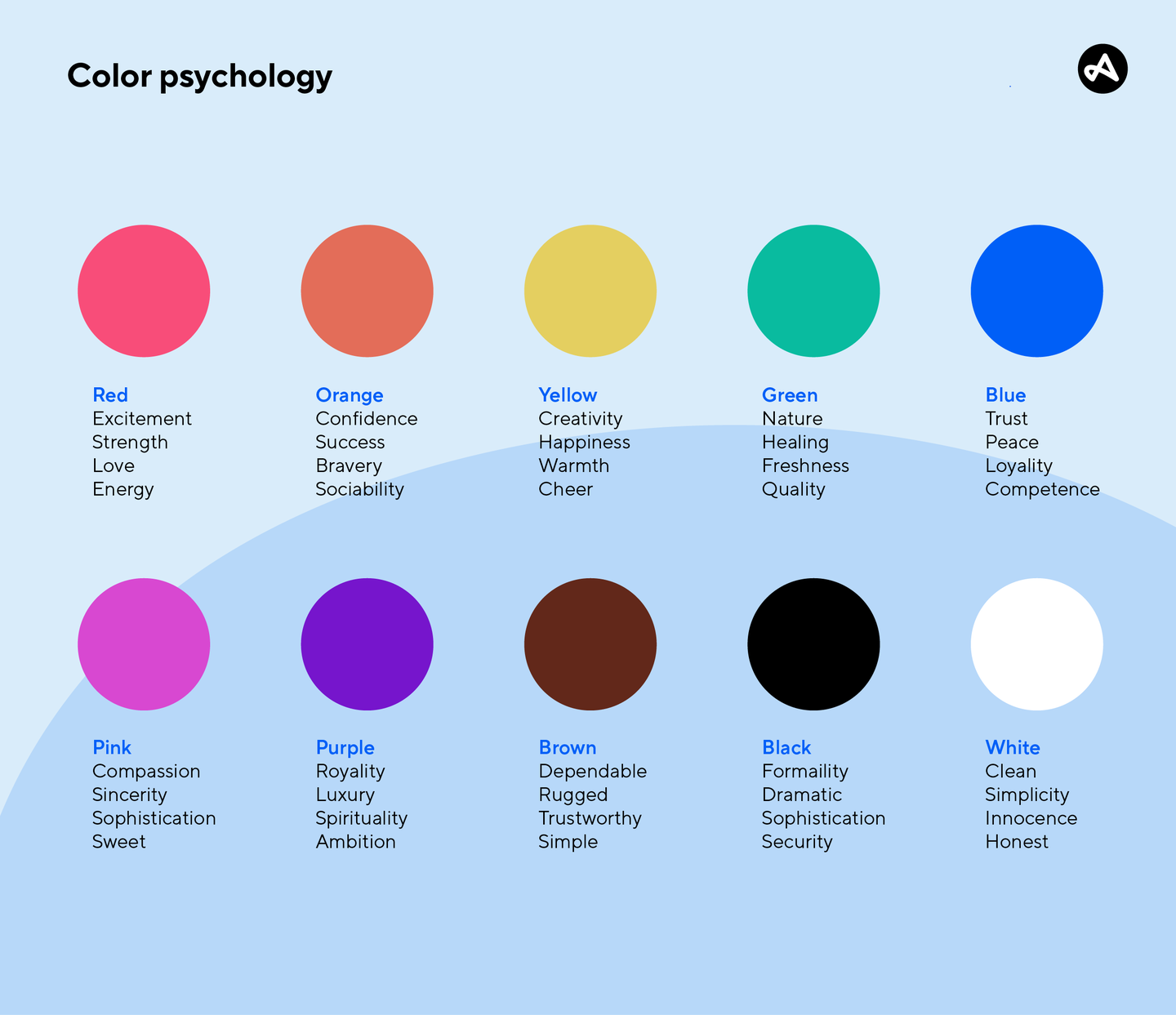
The choice of color in marketing materials, logos, products, and ads can impact everything from user perception to user interaction. Colors can be associated with an item often found in that color (Think: green with money or plants, yellow with bananas, blue with water, etc.) or with an emotion. Here are some general examples of how colors are thought to influence emotions:
- Red: Passion, excitement, urgency, energy, aggression, danger, love, and intensity.
- Orange: Enthusiasm, creativity, warmth, fun, youthfulness, and approachability.
- Yellow: Happiness, optimism, caution, brightness, cheerfulness, and energy.
- Green: Nature, growth, tranquility, health, freshness, stability, and wealth.
- Blue: Trust, calmness, professionalism, reliability, serenity, and intelligence.
- Purple: Luxury, mystery, spirituality, royalty, sophistication, and ambition.
Even the absence of color, in the form of black and white, can influence user perception:
- Black: Power, elegance, formality, sophistication, strength, and mystery.
- White: Purity, cleanliness, simplicity, innocence, minimalism, and peace.

How to use color psychology in marketing
There’s no one-size-fits-all application when it comes to choosing a color. Just take a look at these app icons across a variety of verticals. Each vertical represents the entire rainbow of colors.
For example, a lot of fintech apps, including American Express, Chase, and Venmo use blue to convey trustworthiness and reliability. However, apps like Bitcoin have chosen a stark contrast in the form of orange–the color opposite blue on the color wheel–to visually stand out among the crowd.
Brands will have different personalities, as well. One e-commerce app may have a brand centered around elegance and sophistication, while another may focus on vibrance, youth, and energy.

The psychology behind color preferences can vary across different cultures and demographics, making it crucial for marketers to consider their target audience when choosing colors.
Scarcity: The psychology of limited resources in marketing
What is scarcity marketing?
Scarcity marketing leverages the economic principle of scarcity—the gap between limited resources and theoretically limitless wants—to create a sense of urgency and increase demand for a product or service. This technique involves presenting offerings as limited or exclusive, thereby heightening their perceived value and desirability among consumers.
Scarcity taps into the fear of missing out (FOMO), a powerful motivator in today's digital age. One common approach to implementing this principle in marketing is through limited-time offers, where a deal or a special feature within an app is available only for a short period. This creates a sense of urgency, prompting users to act quickly to take advantage of the offer before it expires. Another method is the use of limited-quantity offers.
Phrases like "while supplies last," "exclusive access," or "limited edition" imply scarcity. Visually, countdown timers or stock levels displayed on a product can enhance the perception of scarcity, nudging users toward quicker decisions.
Let’s look at a few examples from real apps.

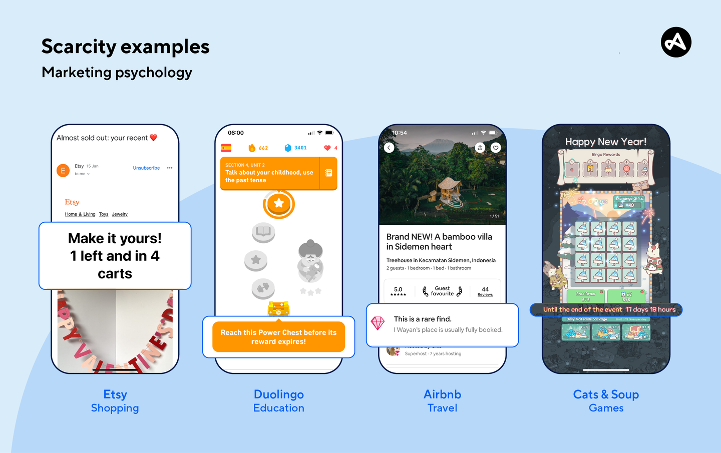
- Shopping app Etsy sends marketing-consented users a marketing email when an item in their wishlist drops reaches a low inventory threshold. Not only do they let you know there is only one left, but they also tell you how many other users have the item in their carts–creating an immediate sense of urgency, and competition to be the one to purchase the last product.
- Education app Duolingo peppers time-limited offers throughout their user journey like this Power Chest, which is labeled as expiring in one day and 23 hours. A countdown timer urges the user to act before the reward is gone.
- Travel app Airbnb displays a message on popular property listings saying “This is a rare find”. The secondary message lets the user know the property is usually booked, tempting the user to act quickly before they lose access to the dates they are looking at.
- Gaming app Cats & Soup is leveraging three instances of scarcity in the above example. Firstly, they display a countdown timer at the bottom of the event screen, letting the user know they can only access the exclusive mini-game for the next 17 days. Then, they employ limited resources in the form of five ad-skip passes and five free plays, which re-generate each day.
Prioritizing ethical psychological marketing
It is crucial to navigate this field with an ethical compass. Remember that your end goal in exploring the psychology behind marketing is to influence consumers, not manipulate them. Make sure that your marketing is transparent and that your app delivers on the promises of your advertising. This is essential for building lasting trust and relationships with consumers.
Some things to avoid in order to maintain ethics:
- Promoting scarcity when it doesn’t exist. If there are more than five items left, don’t tell your app users that there are only five. Be honest!
- Inflating user reviews. If you display an average star rating, for example, don’t take the average of only the positive reviews.
- Creating false testimonials. Good, thorough testimonials can be hard to get when your app is starting out. But don’t skip steps by creating fake profiles and writing positive reviews. Instead, implement prompts throughout the user journey to get genuine feedback.
It's clear that integrating psychology principles into your marketing can bring success. The real magic, however, lies in applying these insights ethically and responsibly, focusing on influence rather than manipulation to build trust and authenticity. Remember, what works for one app may not work for another. A crucial part of this journey is A/B testing, which allows you to fine-tune these psychological strategies to see what resonates best with your specific audience.
By testing different elements, whether it's color schemes, the framing of social proof, or scarcity tactics, you can discover the most effective approach for your app. This not only ensures that your strategies are grounded in real user preferences but also helps in crafting a more personalized and impactful user experience.
Get savvy with your marketing measurements across the user funnel using Adjust's top-notch mobile measurement tools. Ready to see the magic in action? Request a personal demo now and elevate your strategy!
Be the first to know. Subscribe for monthly app insights.

Social proof: The psychology of social influence in marketing
What is social proof?
Social proof uses the influence of the majority or key influencers to sway consumer decisions. Essentially, it’s the ‘bandwagon’ of marketing strategies.
Social proof harnesses the human tendency to be influenced by others' actions and opinions. When used effectively in mobile app design and psychology-based marketing, it can significantly increase installs.
Incorporating elements of social proof can be as simple as adding user ratings and reviews prominently throughout the user experience and/or marketing materials, like testimonials on a campaign landing page. Showcasing high ratings and positive reviews from current users can immediately elevate the perceived value and trustworthiness of the app to potential new users.
Let’s look at a few examples from real apps.